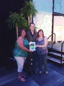
Phillip’s team members Sue Z (Designer) and Claudia (Horticulture Technician) accepted the International Plantscape Award for Design at Cultivate17 in Columbus, Ohio on behalf of Phillip’s Interior Plants & Displays. The Award for Design is judged on various aspects of the project such as form, shape, texture, color, scale, proportion, creativity, originality, container selection and special features, and further consideration is given to horticultural aspects such as light, temperature, and maintenance requirements. Scroll down to read all about our award-winning project!
Of course, Cultivate isn’t just a place where our team goes to pick up awards. As the largest horticulture trade show in North America, Cultivate is an excellent resource for us to learn about upcoming design trends and “pruning” edge plant maintenance techniques.
We aren’t all business on these trips, but we are always plant people wherever we go! We made time to sightsee and get further inspired at the Franklin Park
Conservatory and Botanical Gardens.
International Plantscape Awards Submission
Category: Design
Entrant: Phillip’s Interior Plants & Displays, Oak Brook, Illinois
Team: Jan P (Sales & Design), Sue Z (Custom Moss Wall Design & Creation), Jose G (Installation), Bravo B (Installation)
Client: Biotech Company in the Chicago Suburbs
Project Description:
The design challenges surfaced right from the beginning. The client was moving into a new space, but there were no architectural drawings, no furniture plans, no walls, no flooring, and no known budget. All they really knew was that they wanted a fresh and funky new look incorporating color and they didn’t want to have the fungus gnats their former contractor had failed to alleviate in their old space. What to do? We could provide a design of silk plants only, but is seemed a shame not to include at least some live plants. The client was open to our advice as their professional interior landscape designer and contractor. The idea of green wall resonated with them. Great! A mix of live and silk plants was suggested In order to keep pest and maintenance issues at bay, but still provide the benefits of live plants. Awesome! Let the designing begin!
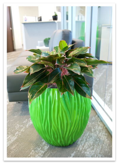
The reception area is the point of first impressions. We wanted to make a statement there with color and content. Bang! Key lime colored Fjord planters from ASI’s Nature’s Green line pull the client’s logo color right into the design. The texture and shape of the containers immediately catch the eye of staff, and visitors to the space and create an interesting focal point. Aglaonema “Siam” was used to incorporate some subtle color and contrast with the key lime container.
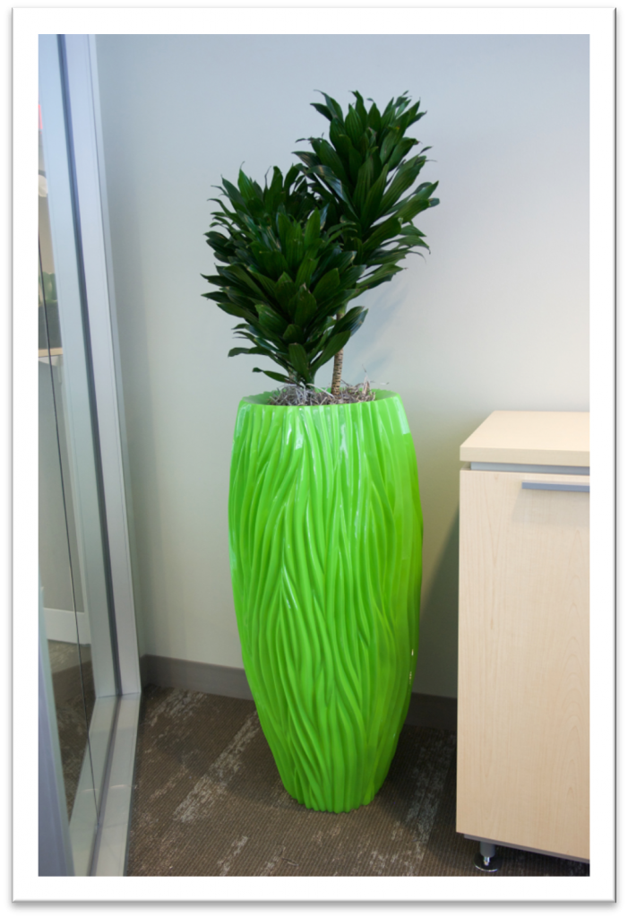
Placement was critical in order to make the best use of limited light sources, but a glass wall between reception and conference room allowed us to benefit from unrestricted sight lines, enjoying the view of specialty containers in two rooms at once. In the conference room, we were able to take advantage of natural light from east facing windows, using Dracaena “Janet Craig Compacta” in another key lime colored Fjord vase. This provided contrast to both the container and the paired plant in reception.
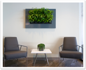
Originally planned for the conference room in order to take
advantage of the available natural light, a Live Picture living wall element from Suite Plants had to be relocated in order to accommodate certain client signage and furnishings. Luckily, there was some supplemental lighting in the reception area, where we were able to truly showcase the living wall opposite the reception desk, and near the reception seating area where visitors might spend several minutes waiting. Although any of the Live Picture frame colors would have worked reasonably well, the choice of a charcoal colored frame was a dead-on match for the furniture and completes the vignette perfectly. The plants selected for the Live Picture (Schefflera arboricola, Draceana deremensis “Lemon Lime”, and jade Pothos provide a mix of textures and growth habits that will fill the space equally well in the long term as the short.
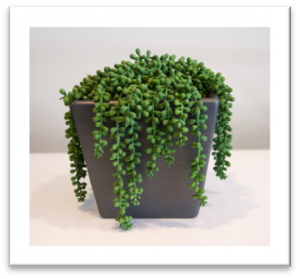
Once delivered, the client fell in love with the artificial succulents that were intended for more limited access spots. A pair of “burro tail type” succulents cascade softly over the rims of ASI European Square containers in a gunmetal finish. These faux succulents continue to grace the reception area and challenge all comers to determine whether they are live or replicated plants. The gunmetal finish of the containers is a recurrent theme throughout the client’s space, tying together the various container styles with their common color.
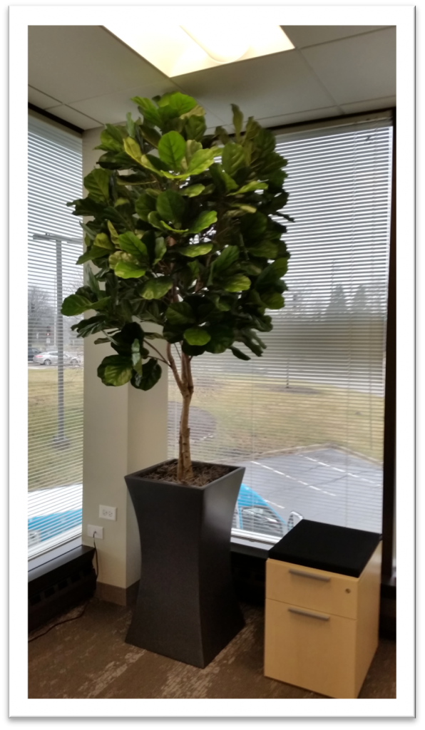
The CEO’s office was a spot of special importance. In initial conversations, the client asked us to include color and interest there. Access was a known concern for maintenance service, so here, as well as in other private offices, silk plants (also known as artificial plants Chicago or even fake plants Chicago) were specified. This very realistic silk Ficus lyrata from Autograph Foliages with its statement foliage and strong presence was a perfect choice. A Symmetry Tall Square container from ASI was selected for its unique shape and to give this special location a personality of its own. The key lime container was swapped out for gunmetal in order to provide more contrast with the foliage color and to better reflect the occupant’s preference.
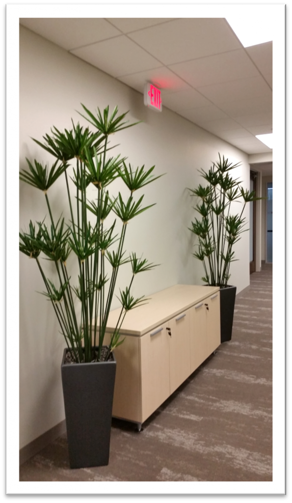
With an eye on light levels, but still wanting to provide appropriate focal points and sight line interest, six foot tall silk Cyperus papyrus from Autograph Foliages was selected for this low light hallway. European tall squares in gunmetal finish placed at angle frame the credenza nicely and give continuity and contrast to the overall design.
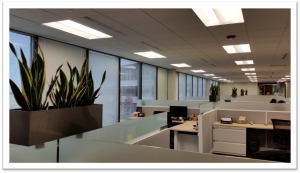
Sansevieria trifasciata “Black Gold” in Vista Rectangle containers from New Pro were specified for the open plan area of the office space. Their graphite color was a great mix with the ASI gunmetal container color used elsewhere throughout the office. We knew the optional mounting brackets were adjustable and would accommodate the varying thicknesses of manufacturers’ product walls. A surprise on the day of installation was the beautiful quarter inch thick frosted glass panels at the top of each cubicle wall. The mounting brackets were not adjustable to that narrow of a surface. The lack of stability from mounting to such a narrow element also presented a safety concern. With some quick thinking and minor placement changes, a successful design adjustment was completed and the rectangle containers were safely placed, creating lines of planters that appear to float throughout the space.
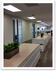
In contrast to the upright nature of the Sansevieria used in the cubicle rectangles, trailing jade Pothos was specified for the rectangle containers used on file tops. The graphite finish links all the rectangle containers into a common element. These plants help soften the hard surfaces of file tops throughout the facility both literally and figuratively. Sounds that may bounce and echo off hard finishes can be absorbed by the softer texture of plant foliage. They also help maintain a clean and uncluttered work space. By communicating that this is a display area, plants prevent the area from becoming a potential collection point for miscellaneous materials looking for a more permanent home.
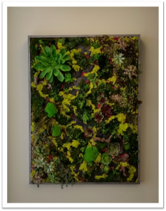
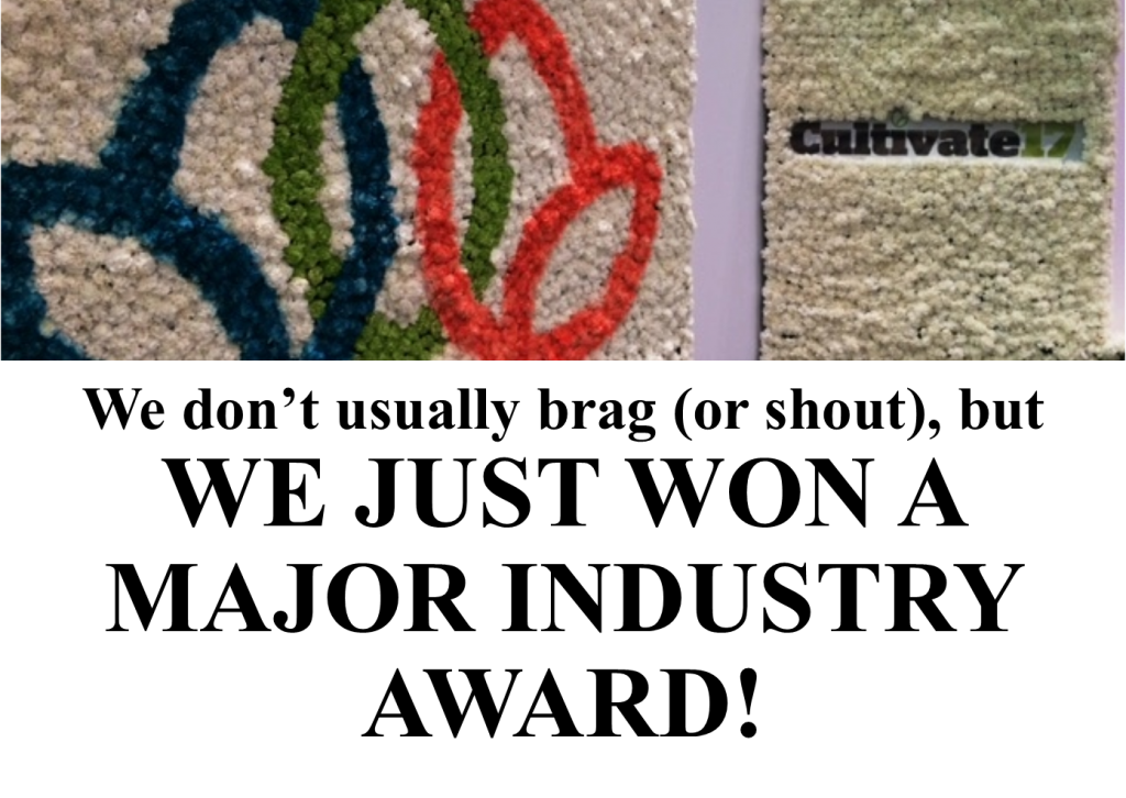
The masterpiece of the project was a 36” x 48” custom designed and hand crafted moss-wall art piece. It is shown here in situ and with a detail image. Using an assortment of preserved mosses, silk vines, and succulents and other natural elements such as wood and stone, a stunning one-of-a-kind work of art was created for this client. The colors used not only replicated the key lime used in their logo and for high profile area containers, but also included complementary and contrasting colors and textures. The custom wooden frame was finished in a hammered silver metallic color that blended with the other container finishes beautifully. Placed in a position of honor outside the CEO’s office, it is truly an art piece for all to enjoy!
By providing a mix of live and silk plants, green walls, pops of color in high profile areas, contrasting container styles bound by common or similar finishes and a one of a kind moss art piece, we accomplished exactly what the client wished for, a beautiful work space that complemented their modern new facility and corporate brand.